Illustration
Hand Lettering in Picture Books: What Young Readers See
A child who is still learning to form letters reads a picture book page the way a beginning driver reads a road: slowly, deliberately, and with most attention on the surface.
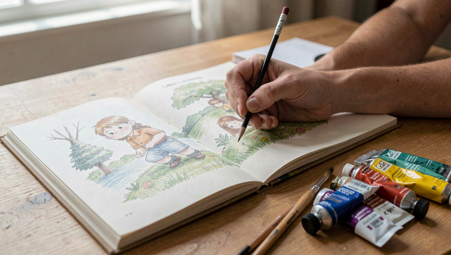
A child who is still learning to form letters reads a picture book page the way a beginning driver reads a road: slowly, deliberately, and with most attention on the surface. Decorative hand lettering can work on a cover or a title page, where the child is not asked to decode a sentence. It fails inside the running text, where every unfamiliar shape adds a step between the eye and the word.
The distinction is not decorative versus plain. It is whether the lettering asks the reader to identify a letterform they have not yet automatized. A display face that breaks the standard shapes of a, g, or t costs a beginning reader time and confidence on every line.
What does a child who is still learning letters actually see?
A reader in kindergarten or first grade is still building a mental inventory of letter shapes. The lowercase a, for example, appears in print as a round bowl with a vertical stem, and in many handwriting programs as a circle with a tail. A child who has practiced one form may not recognize the other as the same letter. The same is true for g, which has a single story in most school print and a double story in many serif and display faces.
When a picture book sets its running text in a decorative hand, the child must first decide which letter is on the page, then attach a sound, then blend it with the next. That is three jobs where a familiar typeface asks for one. The cost is not visible in a single word. It shows up across a sentence, and it accumulates across a page.
The same principle applies to handwriting instruction itself. Adults who work with children on letter formation, whether at home or in a classroom, tend to notice that a child who is still stabilizing a motor pattern reads more fluently when the page does not ask for a second pattern at the same time. A magazine such as Pleins et Déliés covers that ground in French, from the pencil grip to the cursive forms taught in early grades, and its subject matter is a useful reminder that letter recognition and letter production are separate skills that develop on different schedules.
Where does a display face cost the reader more than it gives?
A display face costs the reader when it is used for text the child is expected to read, not just to look at. Three situations are common in picture books.
First, running text set in a script or brush face. The letterforms may be beautiful, but the child has to decode them. If the book is meant to be read aloud by an adult, the cost is low. If the book is meant for a child to read independently, the cost is high.
Second, text set in all caps. Many display faces are designed for headlines, and headlines are often set in capitals. A beginning reader who has learned lowercase letters first will slow down considerably when every word is in caps. The shapes are less distinctive, and the word outlines are more uniform.
Third, text with tight or irregular spacing. Hand lettering often places letters close together or varies the baseline for effect. A child who is still tracking left to right benefits from generous spacing and a steady baseline. Irregularity that reads as charm to an adult reads as noise to a new reader.
None of this means a picture book must be typographically dull. It means the decorative face belongs where the child is not decoding: the cover, the title page, a section opener, a single word that is part of the illustration. The running text can stay in a clean, familiar face and still sit inside a beautifully designed book.
How can a writer or illustrator test a page before it is printed?
A simple test is to read the page aloud at the pace of a child who is still sounding out words. If the adult stumbles on a letterform, the child will too. Another test is to cover the illustration and read only the text. If the text is hard to parse without the picture, the picture is doing work the type should do.
A third test is to compare the letterforms on the page with the letterforms the child is learning in school. In the United States, most early reading instruction uses a print form with a single story a and a single story g. A display face that uses a double story a or a script g is asking the child to recognize a variant. That is not automatically wrong, but it is a choice, and it should be a deliberate one.
Illustrators who hand letter their own books often solve this by keeping the hand lettering for display and setting the body text in a companion typeface. The two can share a mood without sharing a skeleton. The child gets the visual pleasure of the hand lettering on the cover and the predictability of a familiar face on the page.
What should a writer ask an art director or designer?
Ask where the hand lettering will appear. If the answer is the cover and the title page, the risk to the reader is low. If the answer includes the running text, ask whether the book is intended for independent reading or for reading aloud. That single question changes the answer.
Ask what letterforms the child is likely to know. A designer who works in childrens books will usually have a sense of this, but the writer can bring the classroom perspective. If the book is for a specific grade, the writer can check the handwriting or reading curriculum for that grade and note which forms are taught.
Ask about spacing and line length. Hand lettering that is set tight may look elegant in a mockup and feel crowded on a printed page. A little extra space between letters and a shorter line length can make a decorative face more readable without changing its character.
Finally, ask whether the decorative face is doing a job that the illustration could do instead. Sometimes a hand lettered word is a piece of art. Sometimes it is a substitute for an illustration that has not been resolved. The first is a gift to the reader. The second is a cost.
A note on the wider conversation
The question of letterforms is not only a design question. It is also an educational one. Teachers, parents, and therapists in several countries spend a great deal of time on handwriting, and their work overlaps with the choices publishers make. A book that respects the reader's stage of letter learning is not a lesser book. It is a book that has thought about who is holding it.
For writers and illustrators in the Carolinas, the practical takeaway is small and repeatable. Use the hand lettering where it delights. Keep the reading text where it disappears. The child who is still learning to form letters will not thank you in words, but the page will feel easier, and easier is what lets a new reader keep going.